Brand Identity
*
Brand Identity *
Distinctive Marks, Built to Last
A selection of logo and identity work created for organizations at different stages of growth. Each mark balances a clear point of view with the versatility to work across the places a brand needs to live—from a favicon or social avatar to print, product, and campaign materials.
My role: Brand strategy, logo design, identity-system development, and art direction.
Deliverables: Primary marks, secondary marks, lockups, color direction, typography, and identity applications.
Client | Varied Year | 2016–Present
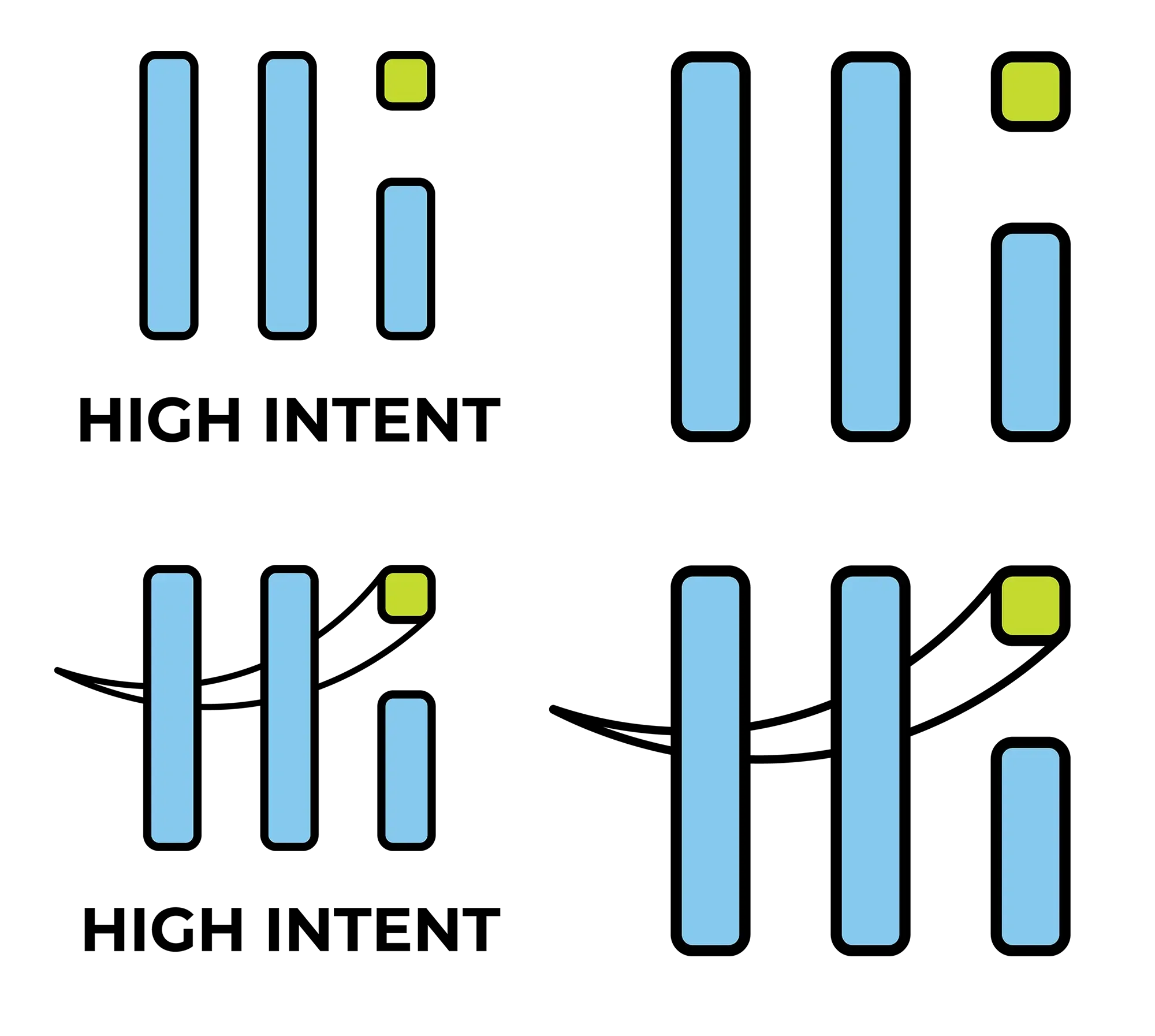
A Signal Built for High Intent

High Intent needed an identity with the clarity and momentum implied by its name. I created a bold, modular mark built from simple vertical forms, paired with an energetic blue-and-lime palette that could feel confident, modern, and immediately recognizable.
A Mark Shaped by the Space
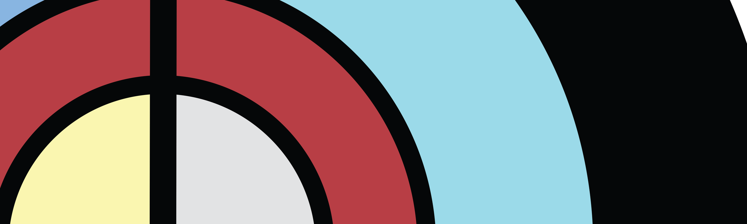
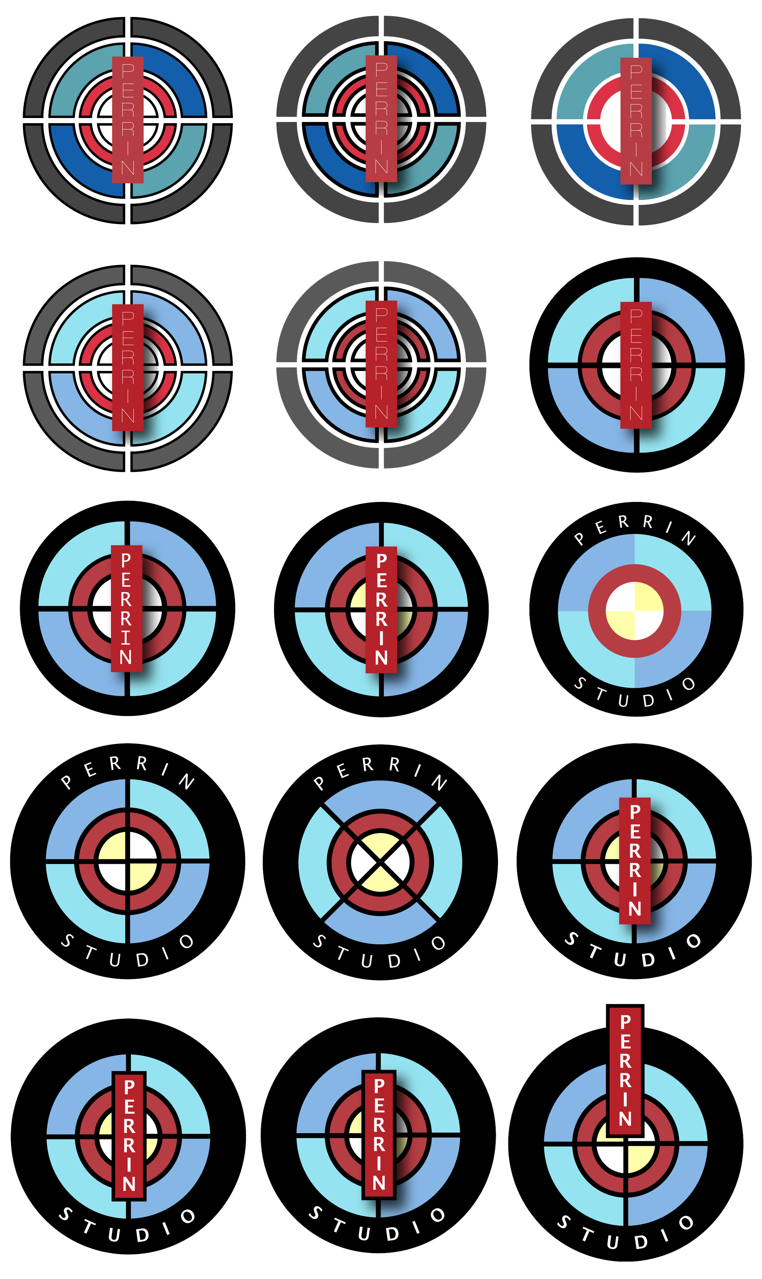
Perrin Studio needed an identity as considered and personal as the photography behind it. During an early visit, Bailey and I kept returning to a stained-glass window in the studio—a distinctive detail that became the starting point for the visual direction.
From Detail to Identity
I translated the window’s concentric geometry, divided panes, and unexpected color relationships into a series of modular studies.
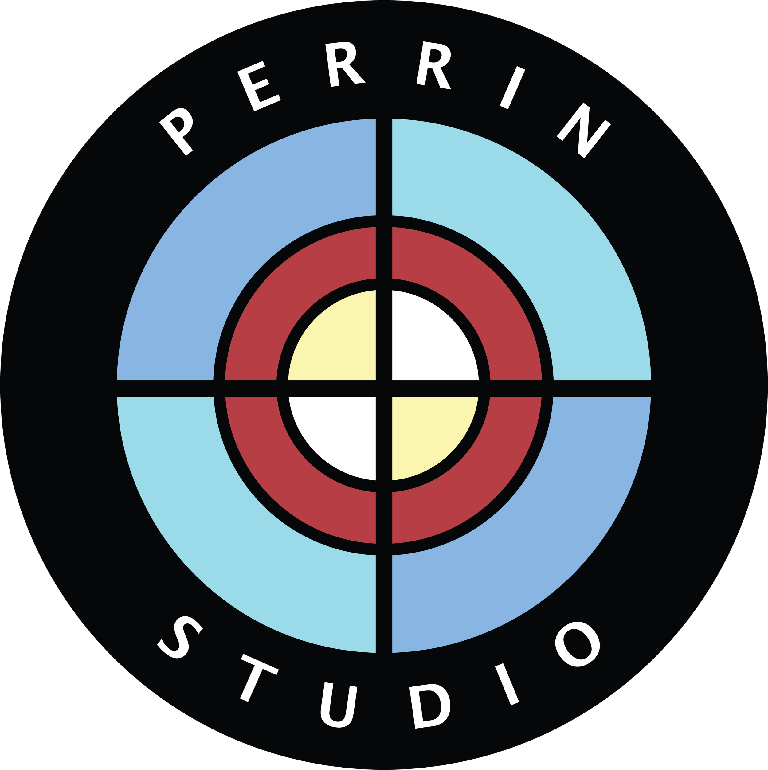
Through exploration and refinement, those elements became a mark that feels both architectural and personal—rooted in the physical character of the studio while remaining clear, flexible, and recognizable across applications.
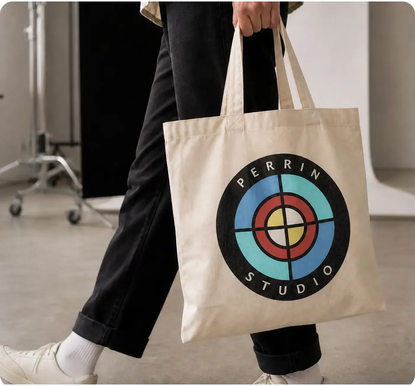
“I hired Ben to design a logo for my photography studio. He has a unique eye, is a clear communicator, and is an excellent collaborator.”
- Bailey Garrot | Owner & Photographer
Built for the Water. Drawn for Impact.
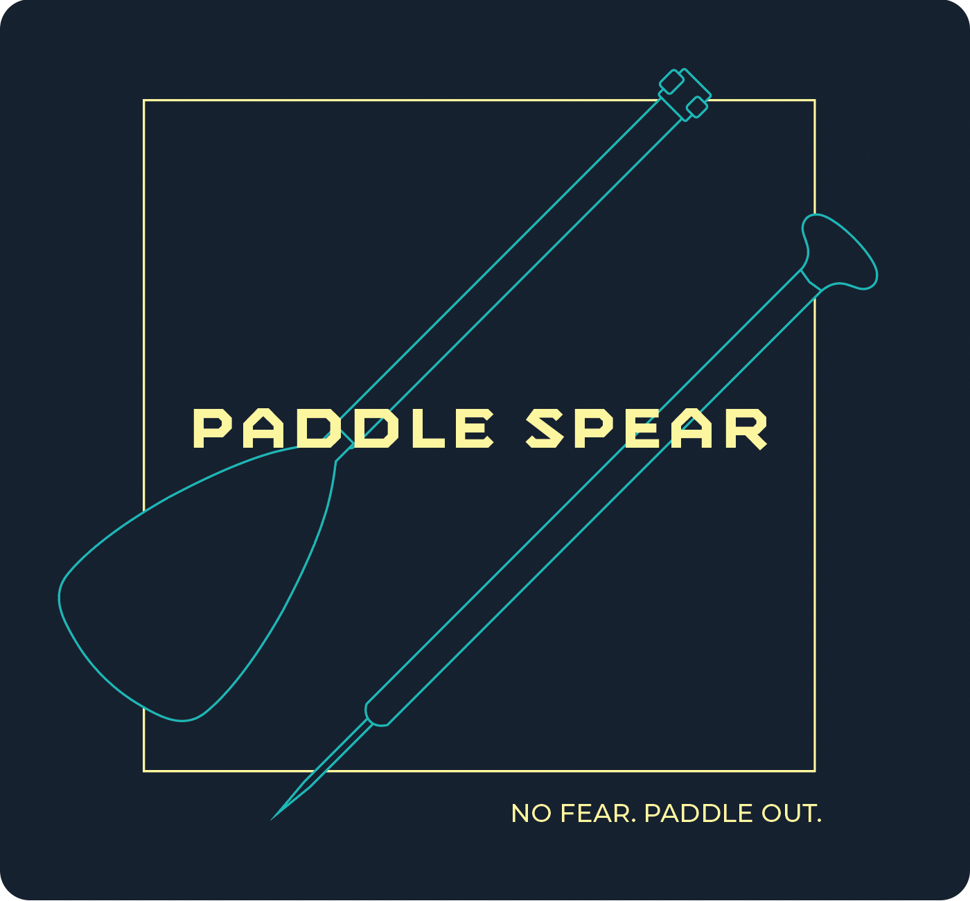
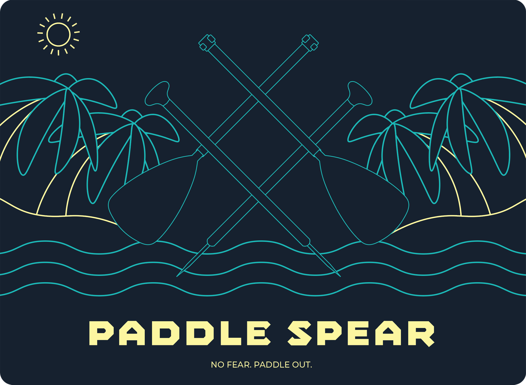
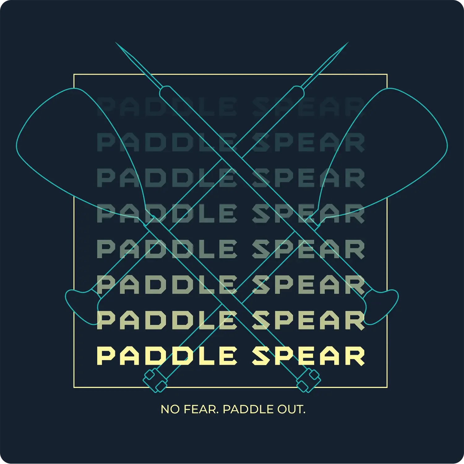
Paddle Spear was built to frame paddle sports as an invitation to explore—not something to approach with fear. The identity draws on the motion, instinct, and independence of being on the water, channeling that energy into a visual language rooted in curiosity and forward momentum.
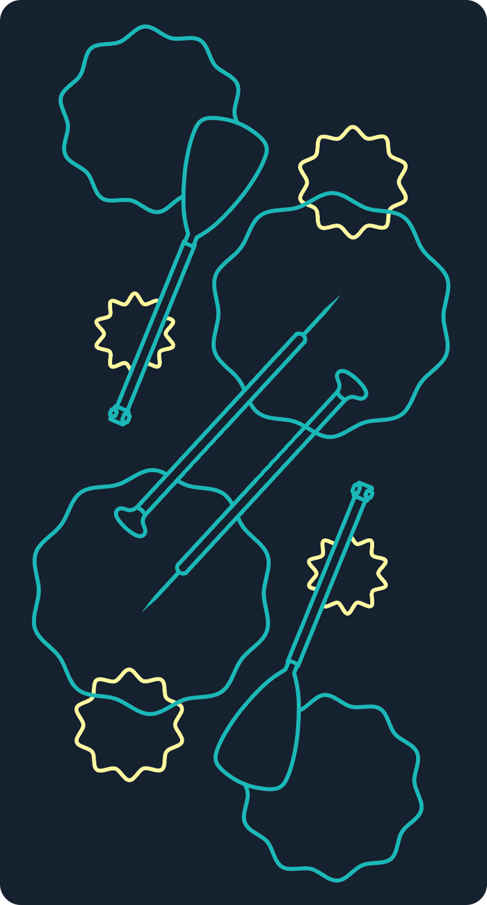
Confidence in Every Form
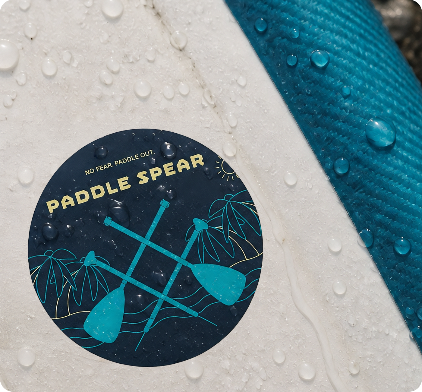
Crossed paddle forms and angular typography give the identity confidence and momentum, while teal linework and sharp yellow accents keep that energy bright, open, and approachable.
Built to move from compact marks to expressive illustrated scenes, the system remains recognizable wherever the adventure takes it—encouraging people to trust their instincts and see the water as a place for discovery.
No fear. Paddle out.