UserIQ
*
UserIQ *
UserIQ — Illustration System for a Playful SaaS Brand

UserIQ was a customer success platform with a voice that brought the spreadsheet to life. The brand needed visuals that could match that personality: smart, approachable, and genuinely fun, while still helping people understand abstract product concepts quickly.
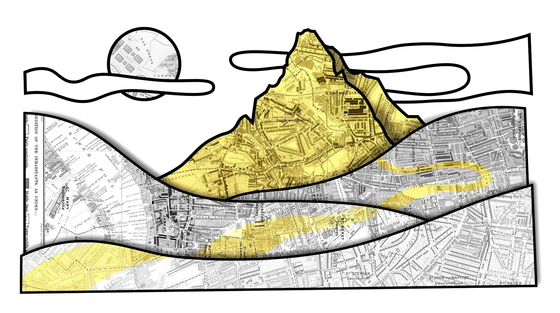
I developed a flexible illustration system within the company’s existing brand framework, combining hand-drawn line work, collage textures, desaturated stock imagery, and selective brand color. The fully illustrated pieces gave the brand its most expressive moments, while the collage-based approach created a faster, more cost-effective way to extend the same visual world across everyday content.
The result was a cohesive toolkit that scaled across campaigns, web pages, podcast artwork, social content, and merch, making complex software feel more human, memorable, and consistent wherever it appeared.
My role: Illustration, visual system development, campaign concepting, and art direction
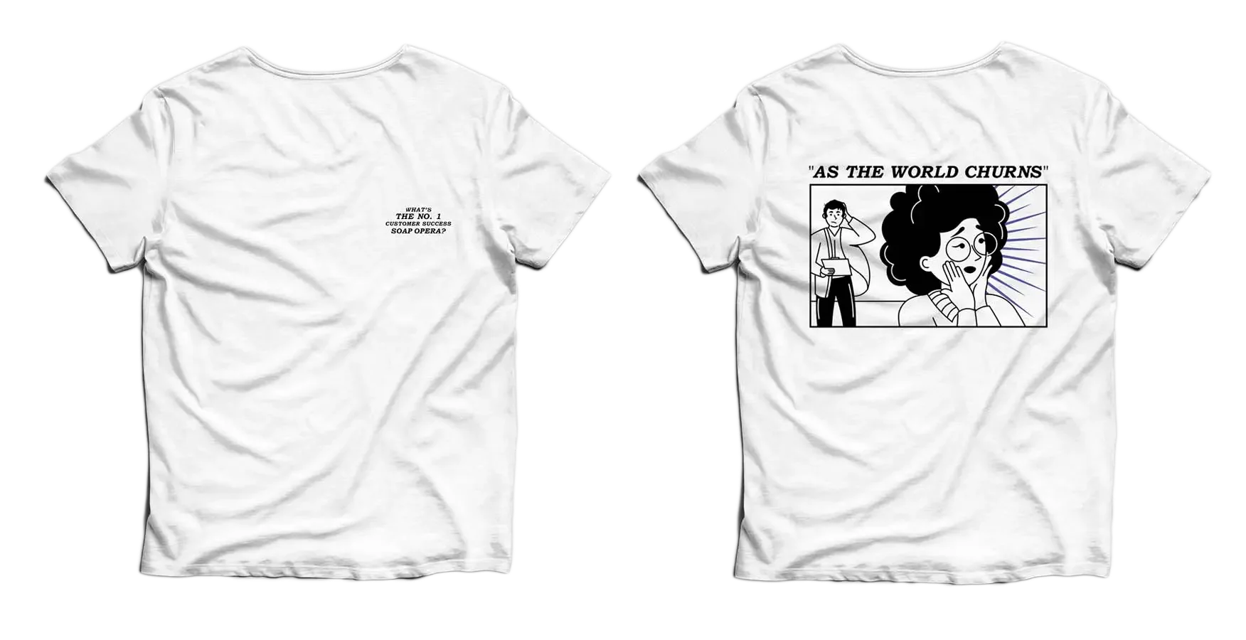
Deliverables: Campaign and web illustrations, social crops, podcast key art, merch graphics, and brand-support visuals
Client | UserIQ Year | 2020
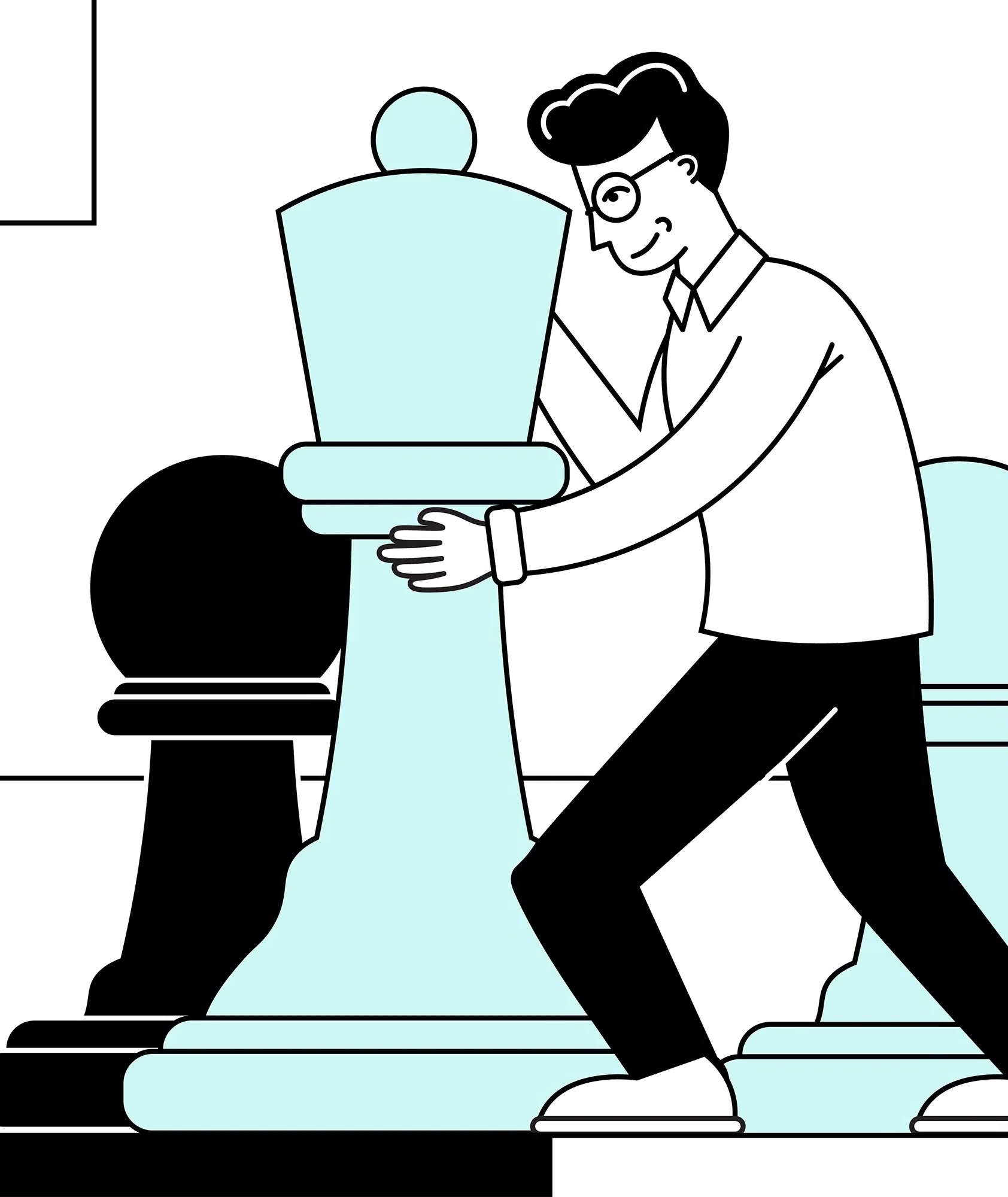
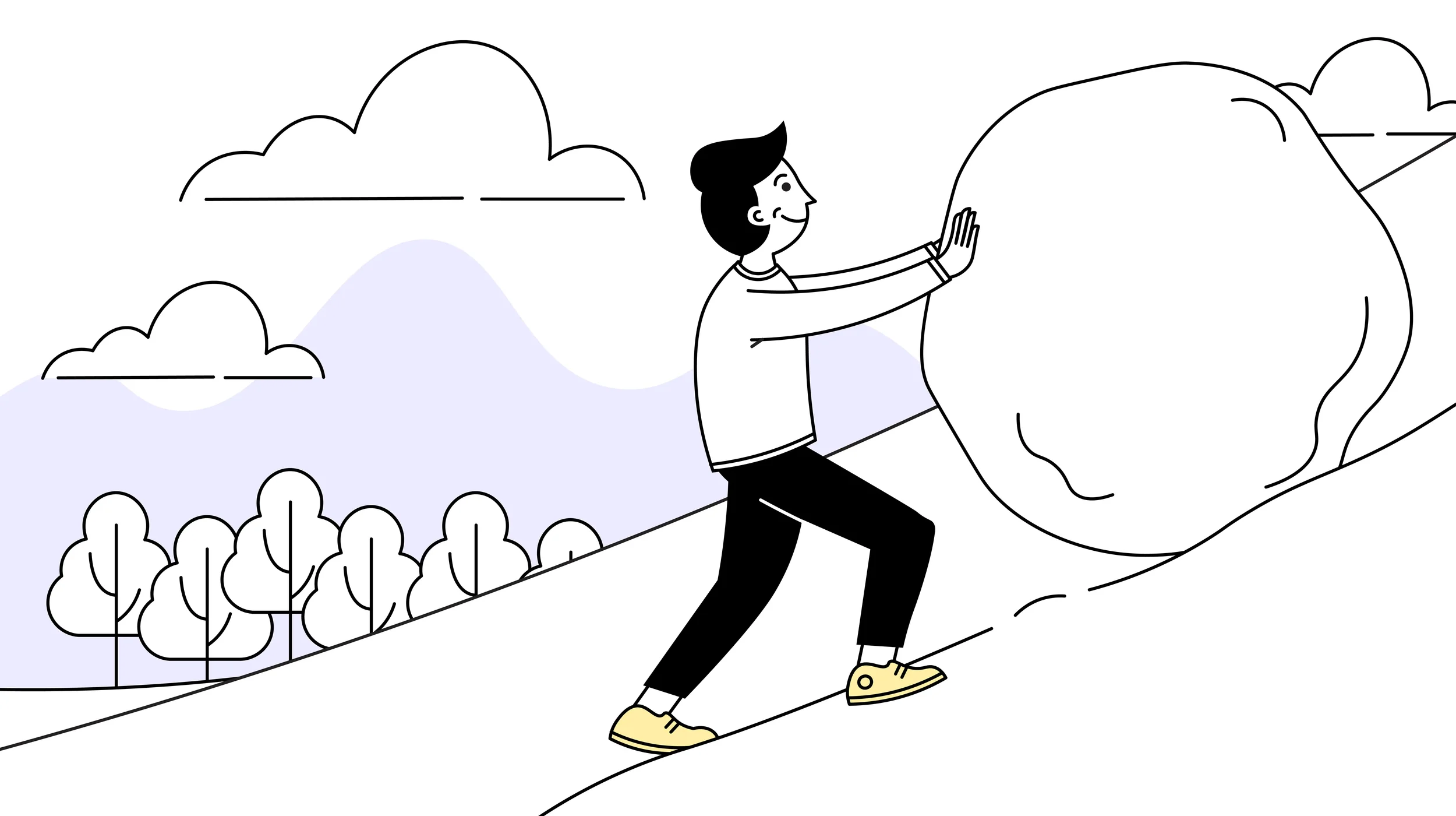
One illustration system.
Many formats.
The system was built to flex. Larger campaign moments could use fully illustrated scenes with more personality and detail, while supporting assets could lean on a mix of collage, line work, and restrained color to move faster without feeling disconnected from the brand.
That balance gave UserIQ a repeatable visual toolkit: expressive enough for big ideas, efficient enough for day-to-day production, and consistent enough to feel like one recognizable brand world.
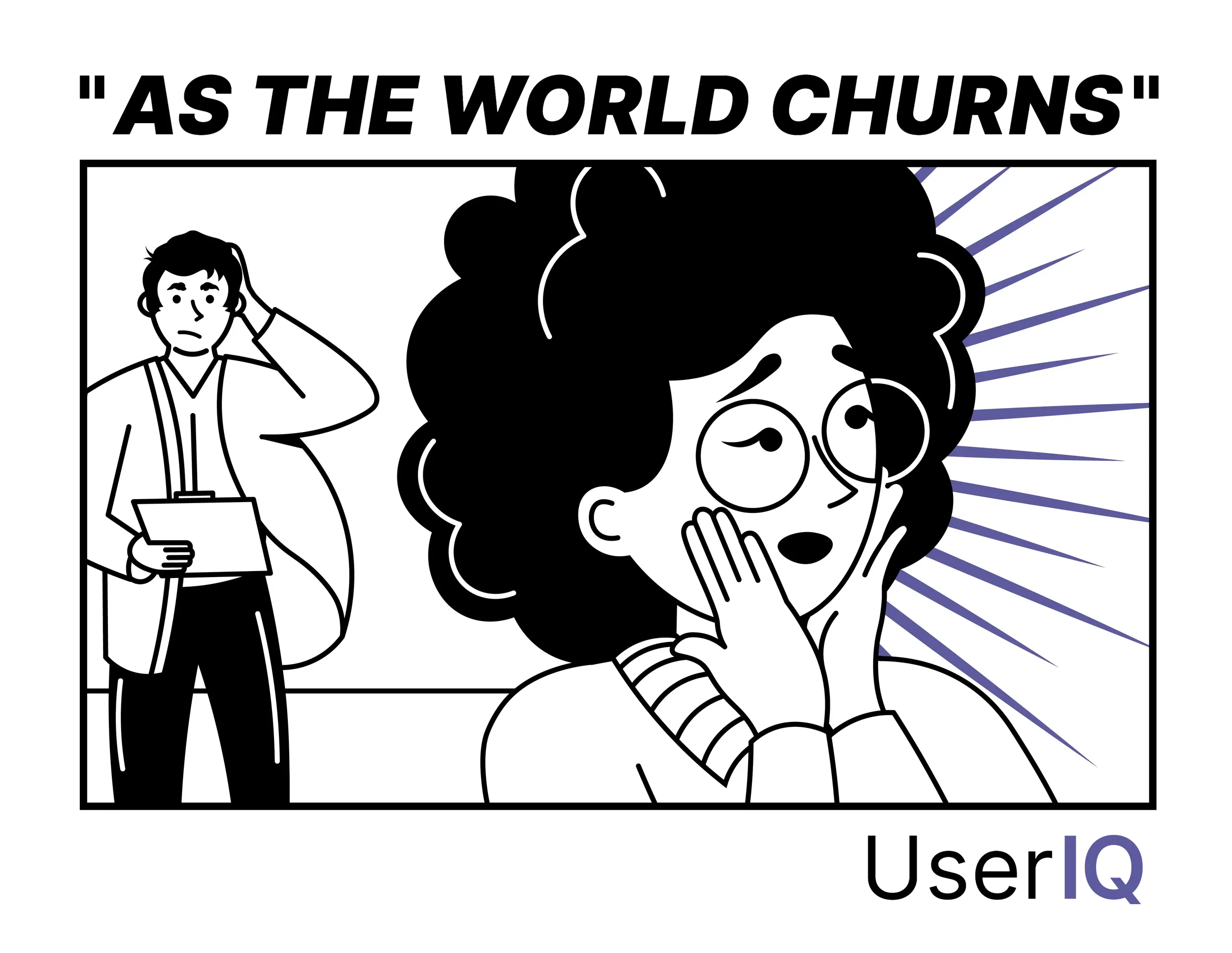
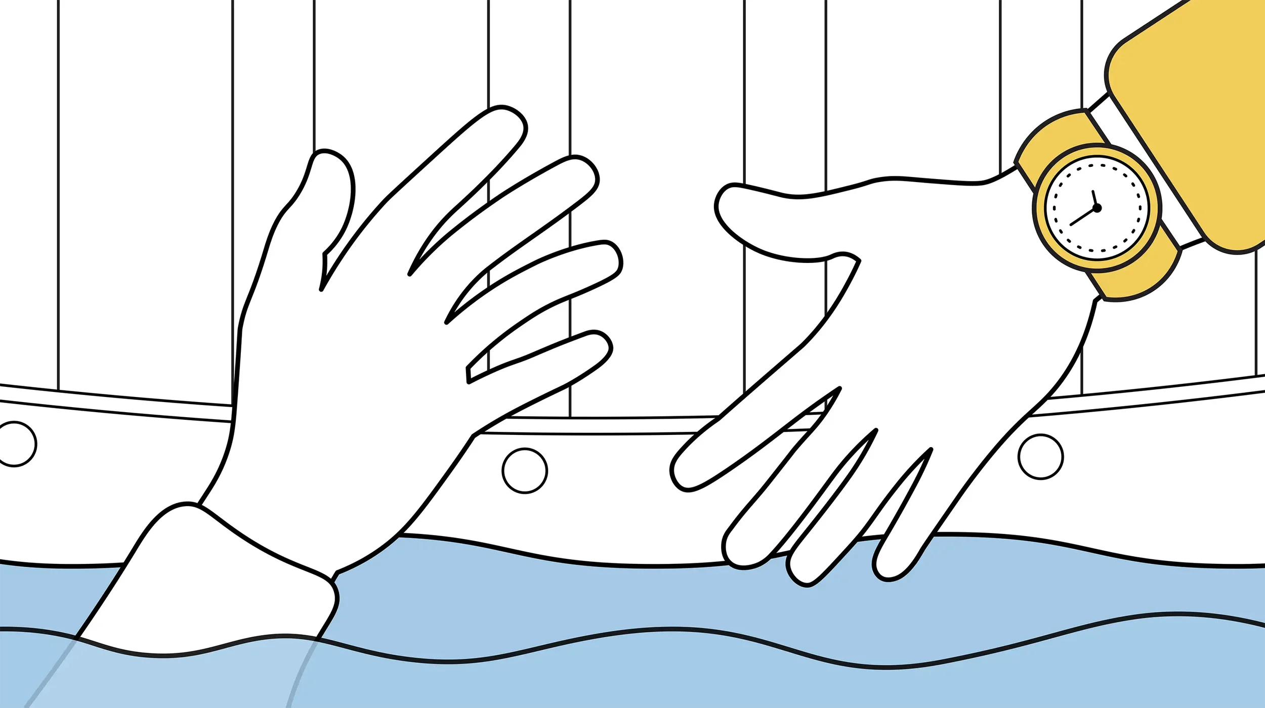
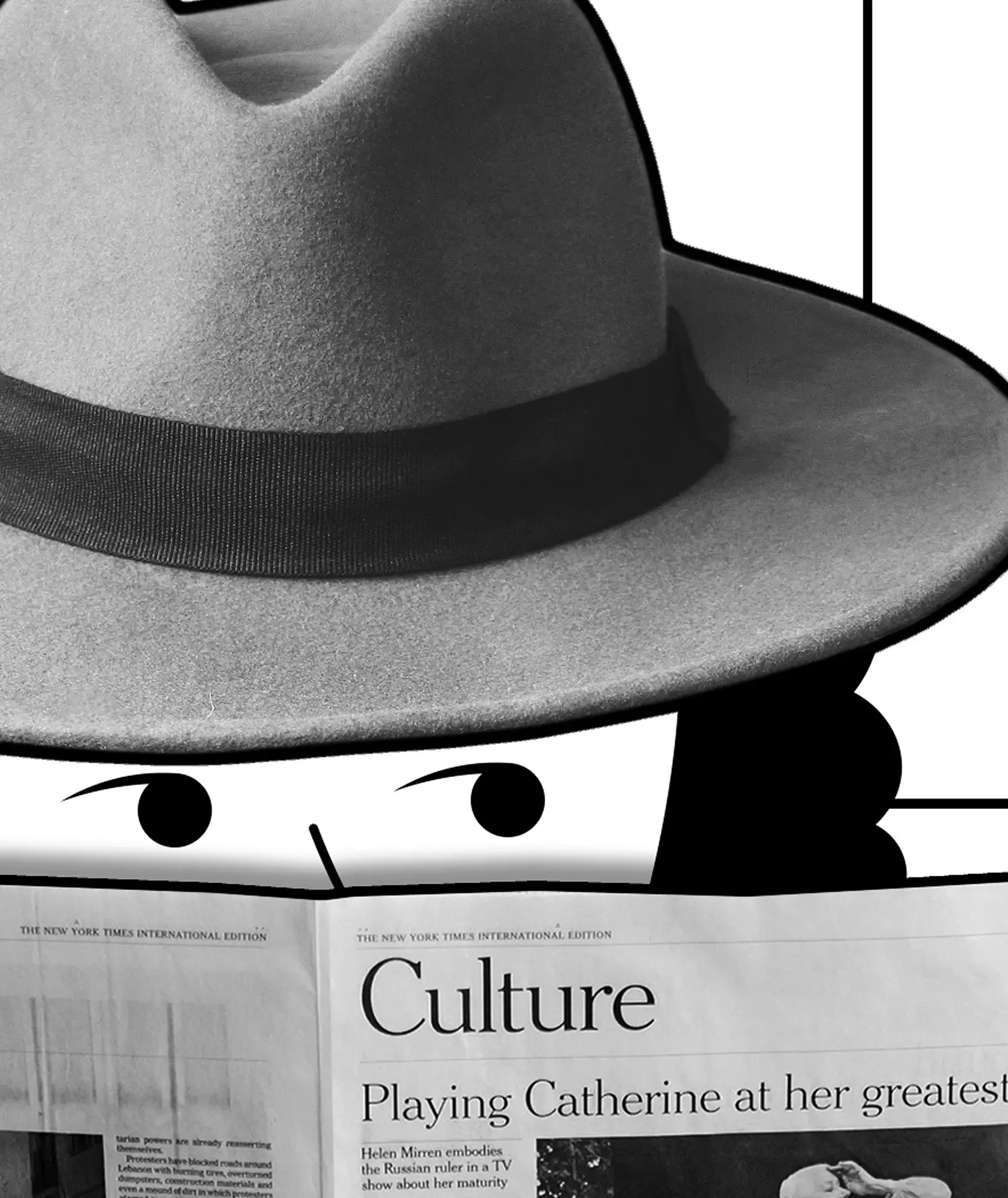
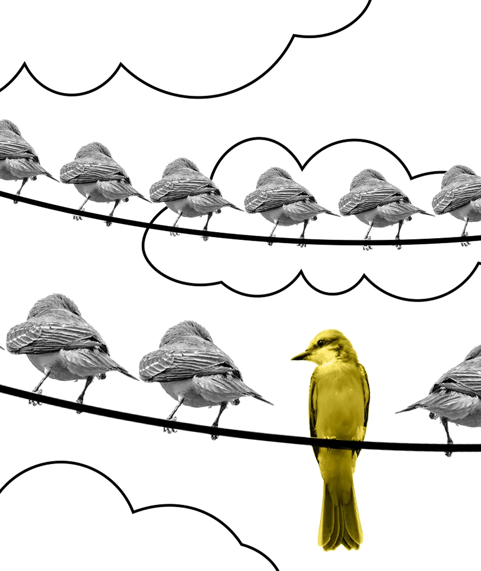
As the World Churns
Customer churn is one of the biggest concerns in customer success, but it is also an abstract, overused SaaS topic. I wanted to turn it into something more memorable by framing churn through the language of a daytime soap opera: dramatic, emotional, and just a little ridiculous.
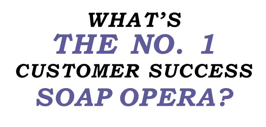
“As the World Churns” used humor and melodrama to make a familiar business problem feel fresh. The concept gave UserIQ a campaignable idea that could stretch from key art to social content and merch, while still connecting directly back to the platform’s focus on customer retention, renewals, and relationship health.
“Clients don’t always know exactly what they need when it comes to art and design. Ben’s a valuable creative partner who has helped me further define my company’s brand identity — while meeting business objectives — and riffing on vague ideas. He’s a creative tour de force”
- Justin Rubner | Brand & Content Director
Make it stand out.
-

Dream it.
It all begins with an idea. Maybe you want to launch a business. Maybe you want to turn a hobby into something more. Or maybe you have a creative project to share with the world. Whatever it is, the way you tell your story online can make all the difference.
-

Build it.
It all begins with an idea. Maybe you want to launch a business. Maybe you want to turn a hobby into something more. Or maybe you have a creative project to share with the world. Whatever it is, the way you tell your story online can make all the difference.
-
Grow it.
It all begins with an idea. Maybe you want to launch a business. Maybe you want to turn a hobby into something more. Or maybe you have a creative project to share with the world. Whatever it is, the way you tell your story online can make all the difference.