I have had the pleasure of working with a variety of clients. Helping others find design solutions is always rewarding.
Perrin Studios
Perrin Studio was looking for a clean classic logo, lightly inspired by easter poster design.

After visiting the unique space the client and I agreed the logo should mimic a beautiful stained glass window that lives on its wall.

“I hired Ben to design a logo for my photography studio. He has a unique eye, is a clear communicator, and is an excellent collaborator.”
The design work led to a continued relationship through photographic retouching. For clients Atlanta Magazine, Xocolate, and other small businesses.


“He is also my go-to for retouching. He takes the burden of complex editing and is a valuable asset to my finished work”

Van Michael

The client was looking for a Van Michael branded T base on an iconic 80s album cover. Motley Crue’s Shout at the Devil was the perfect selection.

CROW


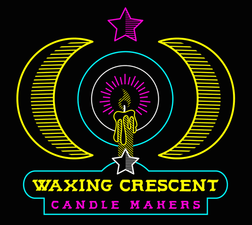
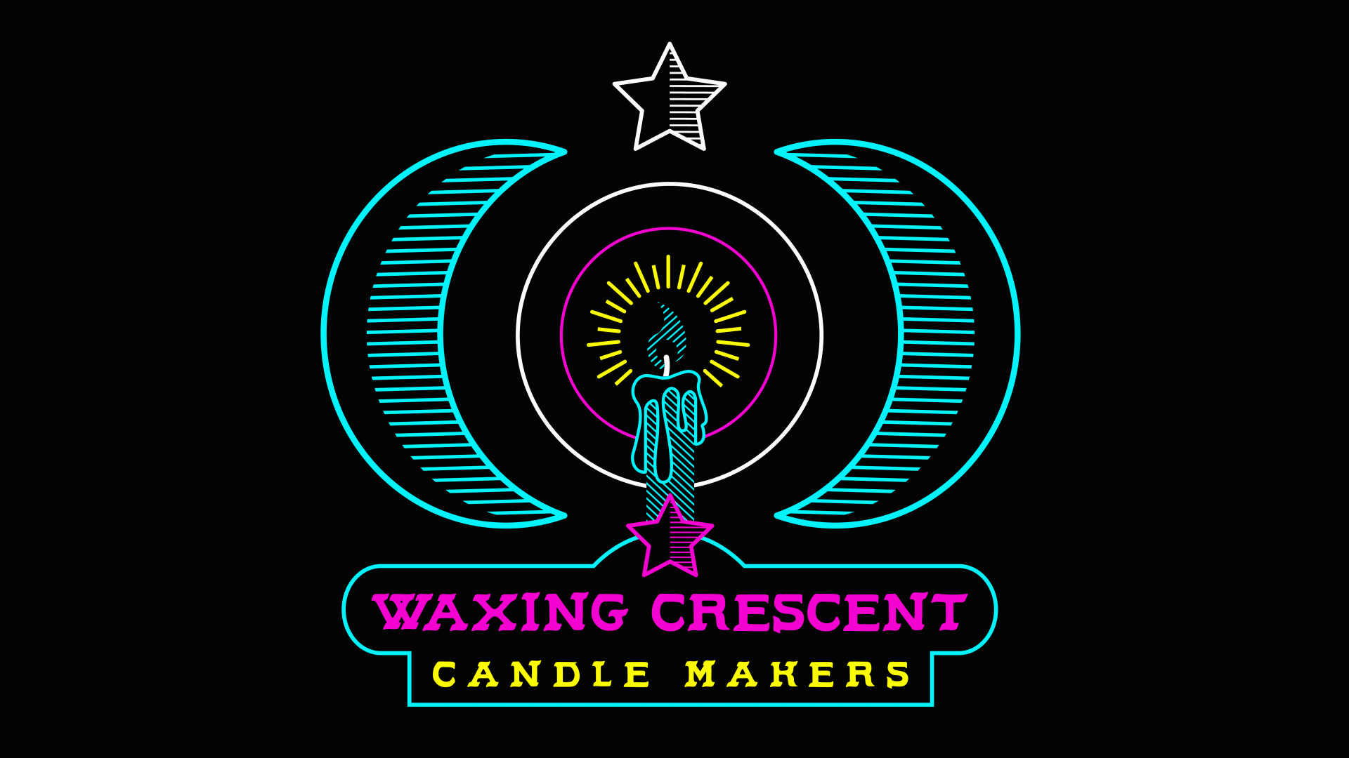
Waxing Crescent
the client was looking for a logo that infused the idea of the occult symbology and a southwestern aesthetic. Classic Moon and star icons bridge the gap between cowboy and occultist.

The entire composition creates an abstract eye, with a candle burning in front. I focused on the idea of neon signs buzzing in the night.

Inspired by that idea and look I created a few animated GIFs and a short animated trailer.